
Traditional metrics often provide a single snapshot or an oversimplified rating, leaving teams unsure how to iteratively improve the product. The truth is, “the problem with current scoring systems is that they are vastly outdated.” We need a better way to quantify and track UX progress, sprint by sprint.
Enter the UX Science Score – a modern, data-driven approach to measuring user experience quality. This new scoring method was created as a solution to today’s UX challenges, designed to generate actionable insights and keep your team moving in the right direction. (It’s built on proven frameworks like SUPR-Q and the PURE methodology, combined with years of UX research experience.)
In this post, we’ll explore how the UX Science Score and its companion UX Science Radar can replace outdated usability scores, helping product teams track improvements across versions and make evidence-based design decisions. We’ll also look at how qualitative feedback and smart prioritization (by frequency, impact, and persistence) drive continuous UX improvements.
Introducing the UX Science Score
The UX Science Score is a composite metric that captures the overall quality of your product’s user experience. Unlike static scores, it’s designed to be used continuously throughout development. Each time you conduct a usability test or UX review, you can generate an updated UX Science Score. This helps teams track progress across sprints and product versions – as changes are made, you can literally see the score move upwards (or downwards) over time.
Behind the scenes, the UX Science Score is calculated using a blend of user research data and expert evaluation. It draws on quantitative user feedback (e.g., survey responses, task success rates) and expert analysis (inspired by SUPR-Q and the PURE methodology). All this is distilled into a single score (out of 100) that stakeholders can easily understand.
The true power lies in watching that score evolve as you iterate. Teams can display the UX Science Score on a dashboard each sprint, making it highly visible. When designers and developers see the score improving after a feature update or redesign, it’s clear validation that their work made a positive difference. And if the score dips, it’s an early warning system that something in the latest release might be hurting the user experience.
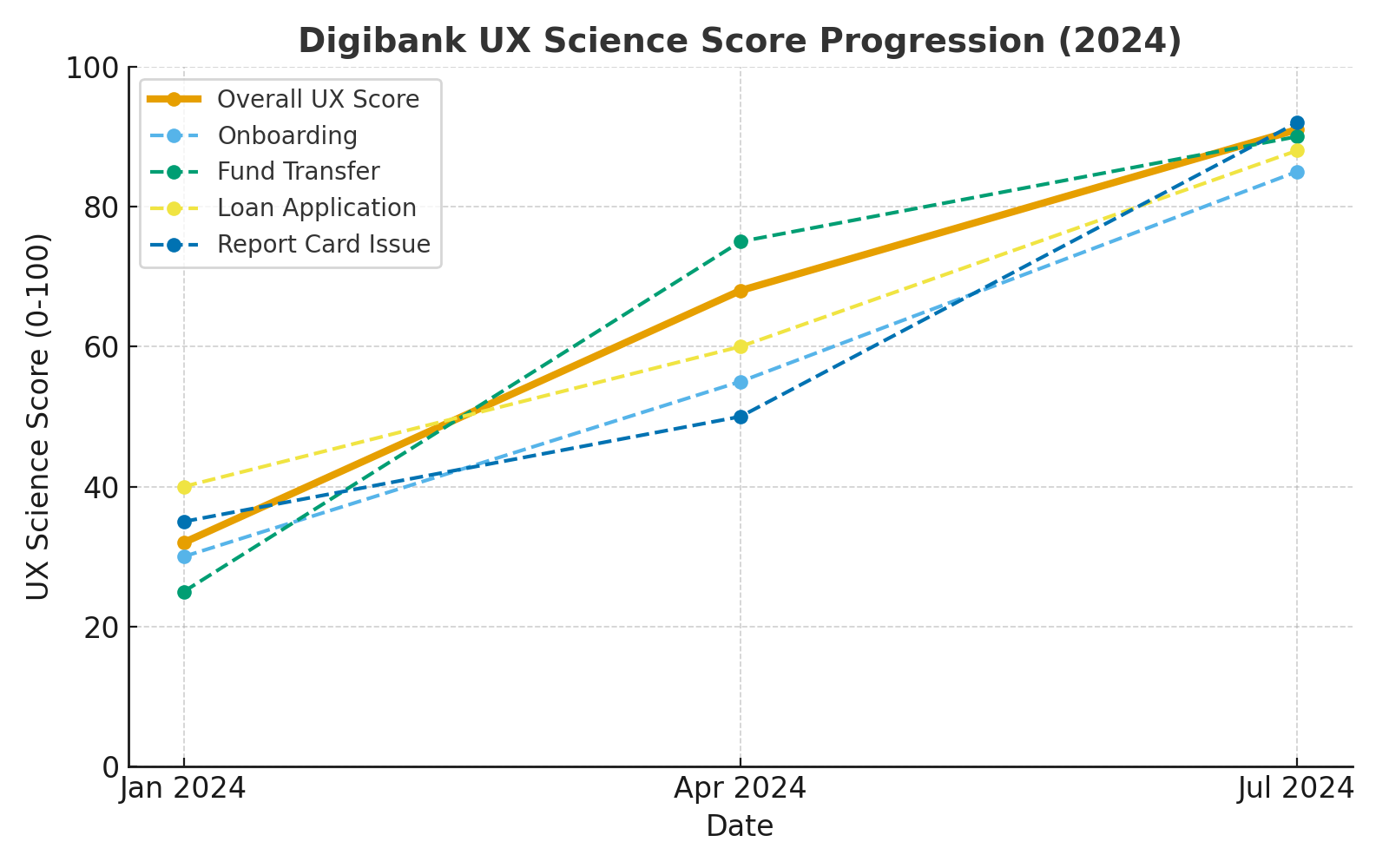
Tracking Usability Across Sprints: Progress You Can See
One of the biggest advantages of the UX Science Score is the ability to visualize UX progress over time. Consider a recent example:
Digibank App – UX Score Over Time
- January 2024: The Digibank app’s first UX Science Score came in at just 32 out of 100. Key flows such as Onboarding (30), Fund Transfer (25), and Loan Application (40) revealed major usability gaps.
- April 2024: After two sprints focused on simplifying navigation and reworking the transfer flow, the overall score rose to 68. The Fund Transfer task jumped dramatically to 75.
- July 2024: By the next release, with clearer content, a refreshed design, and improved onboarding, Digibank reached an overall score of 91. Onboarding scored 85, Loan Application 88, and Reporting a Card Issue 92 – turning previously frustrating tasks into smooth experiences.
Within six months, Digibank transformed its app experience from below average to outstanding – and had the data to prove it. The UX Science Score made it clear which flows were dragging the overall experience down and showed stakeholders exactly how each sprint’s design improvements paid off.
UX Score Improvements
The UX Radar
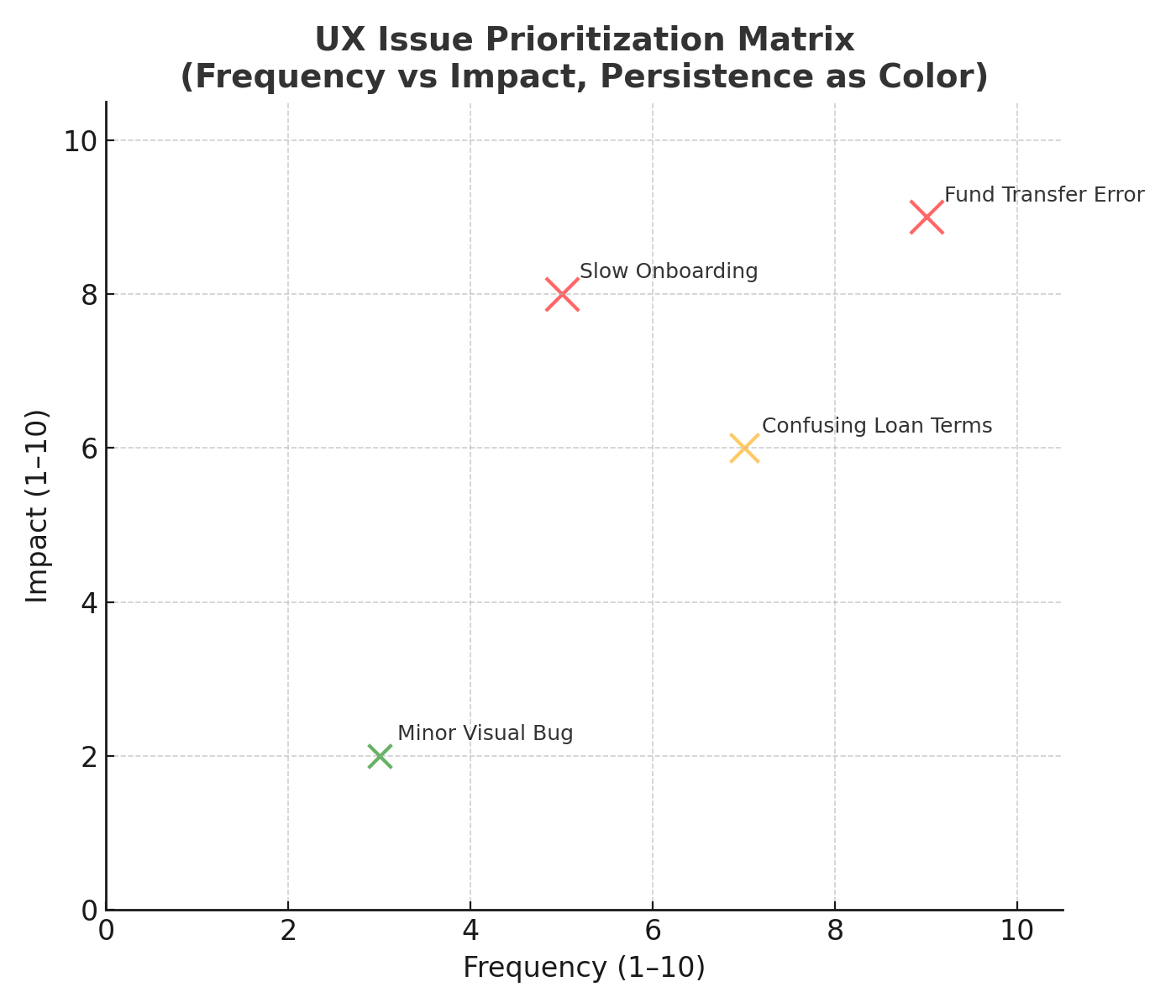
Issue Priorization
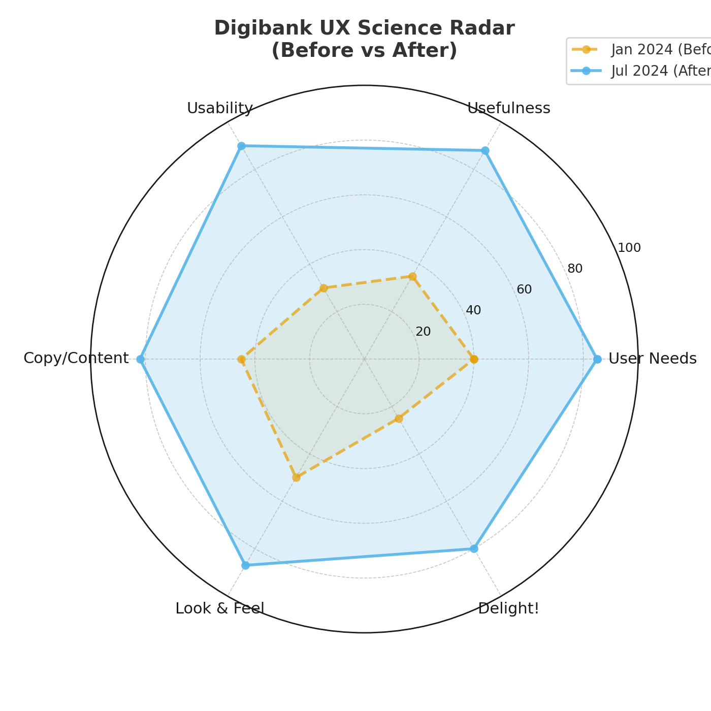
The UX Science Radar: Key Dimensions of User Experience
A single score is useful, but it doesn’t tell you where to improve. This is why the UX Science Score comes with the UX Science Radar – a visual breakdown of the score into its critical components:
- User Needs – Does the product solve the right problems?
- Usefulness – Are features relevant to user goals?
- Usability – Is it easy, efficient, and error-free to use?
- Copy/Content – Are messages and instructions clear?
- Look & Feel – Is the design visually pleasing and trustworthy?
- Delight! – Does the product spark joy and exceed expectations?
The Radar provides teams with a nuanced view. Maybe your product scores high on Usefulness but lower on Usability, meaning users want the features but struggle to use them. Or perhaps the Look & Feel shines, but unclear content drags down the experience. By seeing these dimensions, teams can prioritize the right improvements each sprint.
Iterative Improvement Through Feedback & Prioritization
Numbers are powerful, but they must be backed by insight. After each usability test, the UX Science framework collects qualitative feedback and logs issues in a tracker. Each issue is then prioritized using three criteria:
- Frequency – how often it occurs.
- Impact – how much it disrupts the user experience.
- Persistence – whether it continues across releases.
This ensures the most critical problems are solved first. Over time, product managers can literally see the score rise as persistent, high-impact issues are resolved – and validate improvements in the very next sprint.
Ready to Elevate Your Product’s UX?
In today’s competitive landscape, product managers can’t afford outdated or one-dimensional UX metrics. The UX Science Score offers a fresh, scientific approach that tracks progress, highlights problem areas, and validates improvements.
Adopting this framework can empower your team to deliver products that not only meet usability standards but truly delight users.
Ready to bring some science to your product’s UX? Don’t let your user experience be guesswork – let’s measure it, improve it, and measure it again. Contact our team to learn more about implementing the UX Science Score for your product or to get started with a UX assessment today.