Every product team has skeletons in their digital closet. Those cringe-inducing design choices make users want to hurl their devices out the nearest window. We've all stumbled across these digital disasters, and, let's be honest, we've probably contributed to a few ourselves, no shade, just facts.
Let's dive into five notorious UX offenses that haunt websites and apps everywhere. Consider this your field guide to spotting and reforming these design felons before they wreak havoc on your users.
Let's dive into five notorious UX offenses that haunt websites and apps everywhere. Consider this your field guide to spotting and reforming these design felons before they wreak havoc on your users.
Crime #1: The Pop-Up Piranha Attack
The Offense: Ambushing users with aggressive pop-ups before they can even glimpse your content.
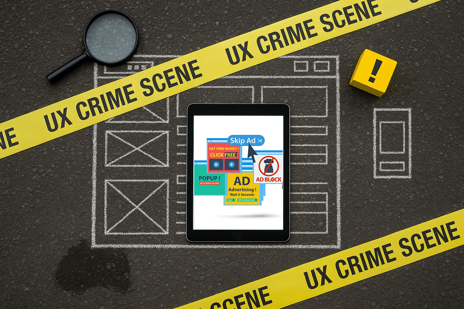
Imagine this: A user lands on your site, eager to explore your game-changing product, only to be bombarded by a frenzy of newsletter signups, cookie consent banners, satisfaction surveys, and discount offers—all layered like a digital lasagna. Studies reveal that 40% of websites deploy these intrusive pop-ups, with some apps incorporating dark patterns in a staggering 95% of cases.
The Evidence:
- Overlapping modals that demand a treasure map to find the "close" button
- Newsletter prompts that pounce before users even understand your site's purpose
- Cookie banners crafted with all the charm of a bureaucratic nightmare
- Exit-intent pop-ups that trigger if your cursor so much as twitches
The Verdict: Pop-ups may drive short-term conversions, but on mobile devices—where screen real estate is precious—they're a usability crime. Users aren't here to play whack-a-mole; they want your content, not a pop-up gauntlet.
The Rehabilitation: If pop-ups are unavoidable, make them dismissible with large, obvious close buttons. Delay their appearance until users have had a chance to engage with your site, and ensure they're mobile-friendly to avoid frustrating your audience.

Orders from high up!
Crime #2: The Form From Hell
The Offense: Demanding a user's life story just to access a simple resource.
Picture wanting to download a quick PDF, only to face a form longer than a tax return. Excessive, nosy forms are a UX sin that alienates users by asking for unnecessary details upfront.
The Evidence:
- Multi-page registration forms for basic account creation
- Checkout processes requesting shipping addresses for digital products
- Vague error messages that leave users guessing what went wrong
- Required fields marked so subtly they might as well be invisible
The Verdict: Research shows that lengthy forms drive users away, especially when they're in a rush. Each additional field is a potential exit ramp to abandonment. Streamlined forms boost completion rates and keep users happy.
The Rehabilitation: Ask only for essential information. Break longer forms into clear, manageable steps with visible progress indicators. Provide real-time validation and clear error messages to guide users smoothly through the process.
Crime #3: The Navigation Nightmare
The Offense: Crafting menus so convoluted that users need a compass to find their way.
Complex navigation systems turn simple tasks into frustrating scavenger hunts. When your menu structure feels like a labyrinth, you've committed a cardinal UX crime.
The Evidence:
- Hamburger menus on desktop that bury critical links
- Overloaded mega-menus with more options than a buffet line
- Confusing navigation paths that spike bounce rates
- Missing breadcrumbs, leaving users lost in the digital wilderness
The Verdict: Effective navigation should be intuitive, even for a sleep-deprived user at 2 AM. Studies suggest users abandon sites if they can't find what they need within three clicks, often fleeing to competitors with clearer structures.
The Rehabilitation: Simplify navigation with concise, descriptive labels. Use sticky headers for easy access, limit menu items to key pages, and incorporate breadcrumbs to help users retrace their steps. Test your navigation with real users to ensure it's foolproof.
Crime #4: The Mobile Massacre
The Offense: Designing for desktop and leaving mobile users to fend for themselves.
With over 50% of web traffic coming from mobile devices, ignoring responsive design is a UX felony. Non-optimized mobile experiences force users to pinch, zoom, and scroll endlessly just to read a sentence.
The Evidence:
- Buttons so tiny they're practically microscopic
- Text that demands a magnifying glass to decipher
- Layouts that refuse to adapt, forcing horizontal scrolling
- Touch targets so cramped they turn taps into misfires
The Verdict: With billions of mobile users worldwide, a mobile-first approach isn't optional—it's essential. Shrinking a desktop site to fit a phone screen creates a frustrating experience that drives users away.
The Rehabilitation: Embrace responsive design that adapts seamlessly to all screen sizes. Test on a variety of devices to ensure usability, and optimize touch targets (at least 44x44 pixels) for easy interaction. Make mobile a delight, not a dexterity test.
Crime #5: The Dark Pattern Deception
The Offense: Manipulating users into actions they didn't intend through sneaky design tactics.
Dark patterns exploit psychological triggers—like FOMO or social guilt—to trick users into decisions against their interests. These deceptive practices are the digital equivalent of a shady sales pitch.
The Evidence:
- Hidden costs that inflate the final price at checkout
- Cancellation processes designed like escape room puzzles
- Confirmation shaming with guilt-tripping phrases like "Don't miss out!"
- Fake urgency tactics, such as "Only 2 left!" or relentless countdown timers
The Verdict: Dark patterns may yield short-term gains, but they erode trust and loyalty. Studies show that 88% of users avoid sites after a bad experience, making transparency a smarter long-term strategy.
The Rehabilitation: Prioritize ethical design with clear, honest choices. Simplify cancellation processes, disclose all costs upfront, and avoid manipulative language. Building trust fosters loyalty and encourages users to return.

UX crimes
The Bottom Line
These UX crimes won't land you in digital prison, but they'll definitely put your user satisfaction on trial. The good news? Addressing these issues can transform user experiences and boost retention. After all, 88% of online consumers are less likely to return to a site after a bad experience, so fixing these felonies delivers immediate rewards.
Whether you're a designer, developer, or digital enthusiast, keep your eyes peeled for these UX offenders. Call them out with a smirk and a gentle nudge toward better practices. Spotting these crimes early beats wading through a flood of angry support tickets later. Create experiences that delight, and your users might just send you a virtual thank-you note instead of rage-quitting.
Whether you're a designer, developer, or digital enthusiast, keep your eyes peeled for these UX offenders. Call them out with a smirk and a gentle nudge toward better practices. Spotting these crimes early beats wading through a flood of angry support tickets later. Create experiences that delight, and your users might just send you a virtual thank-you note instead of rage-quitting.